
Velvet Taco
Velvet Taco
If you haven’t tried Velvet Taco yet… where have you been?!
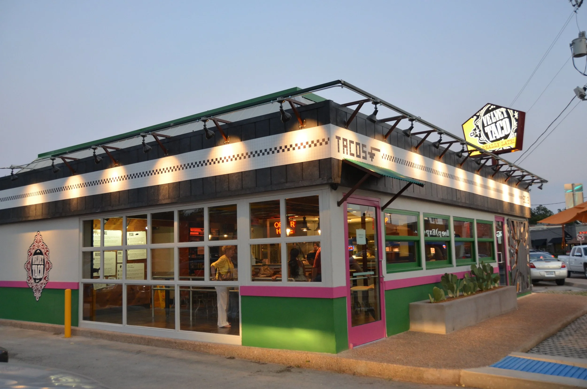
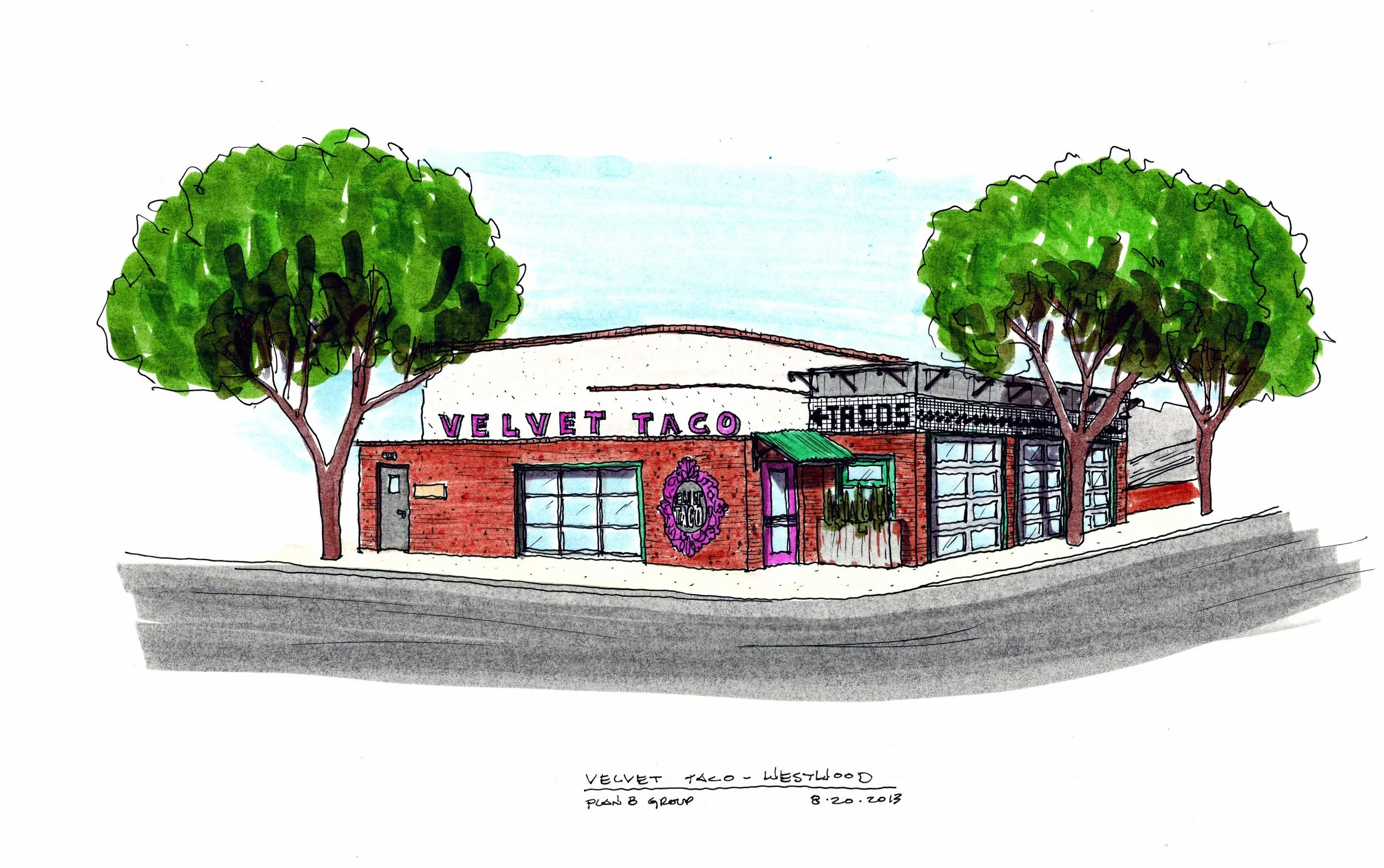
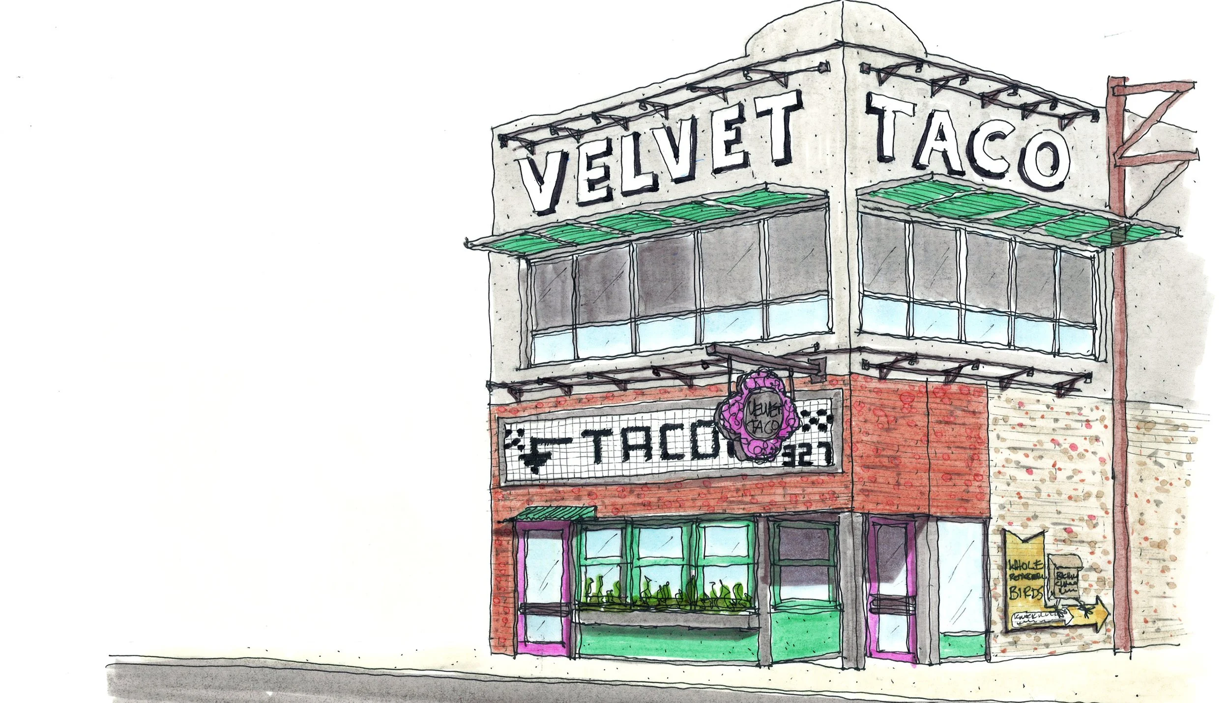
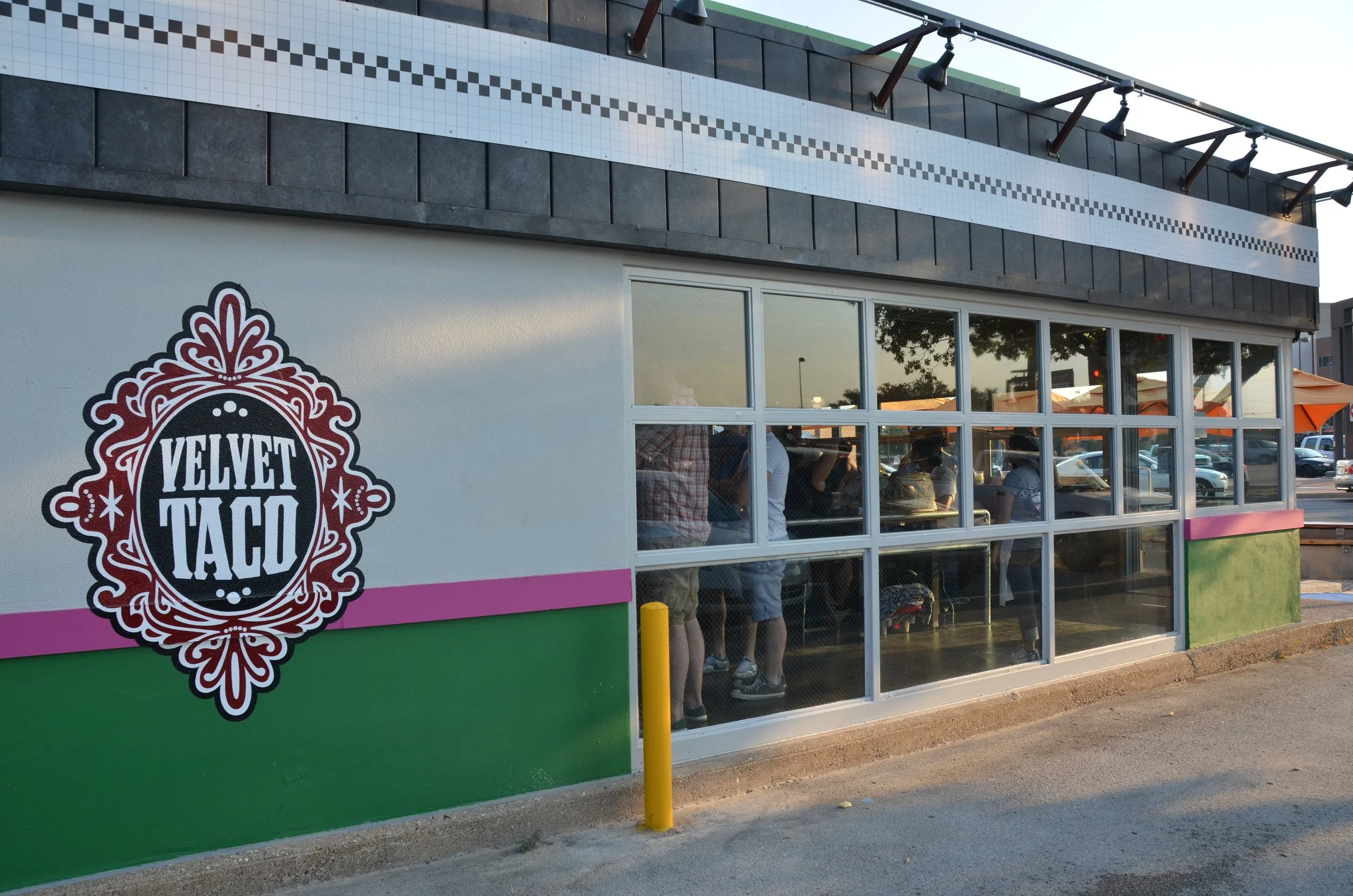
This non-traditional taco shop has taken the nation by storm, and from the beginning, we knew we were helping shape something big. When we designed the very first Velvet Taco in Dallas back in 2011, we were establishing more than just a restaurant - we were defining a bold, unmistakable brand identity built to scale. That single location set the tone for what is now 46+ stores across 7+ states and counting, with international expansion on the horizon.
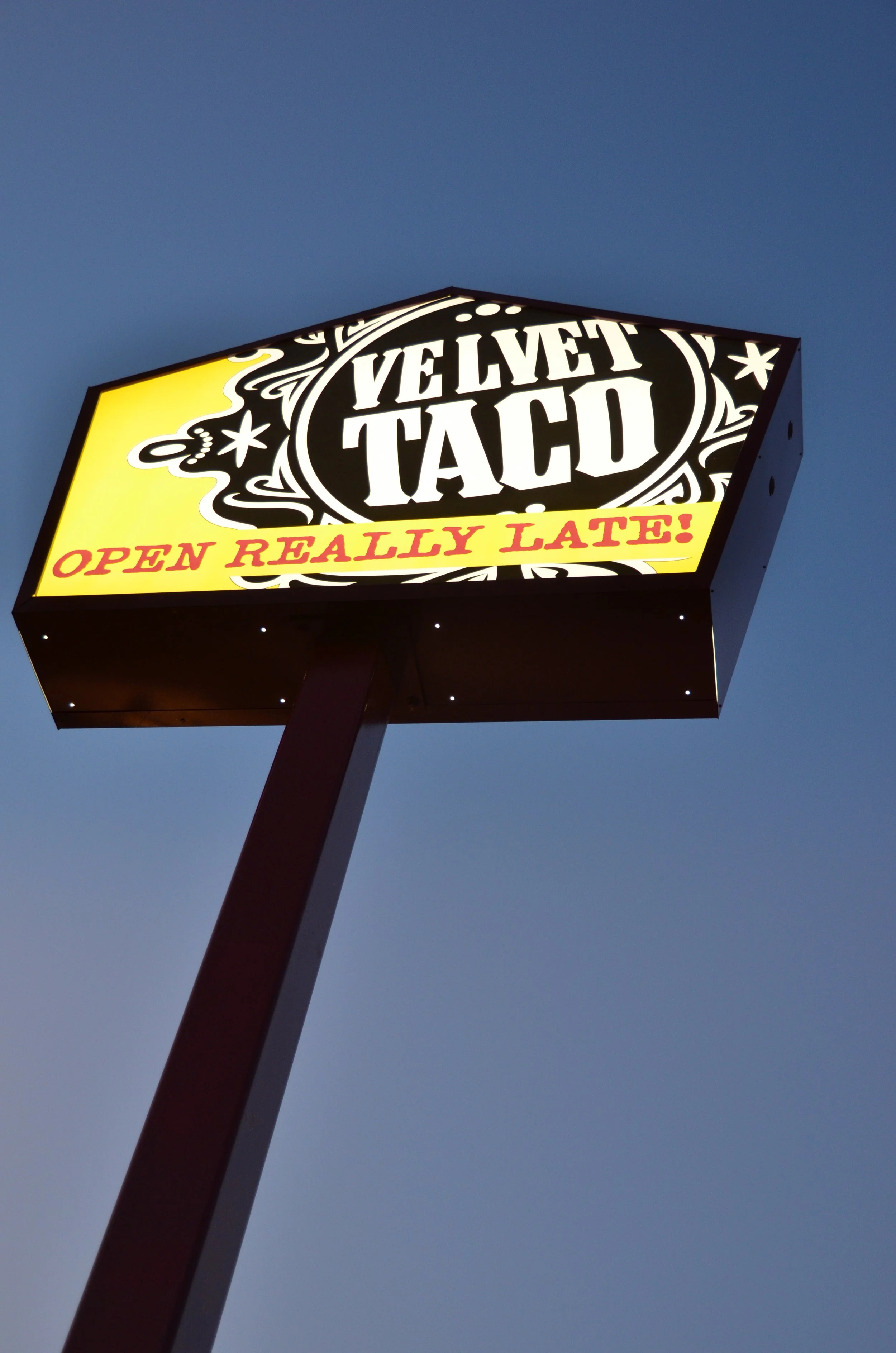
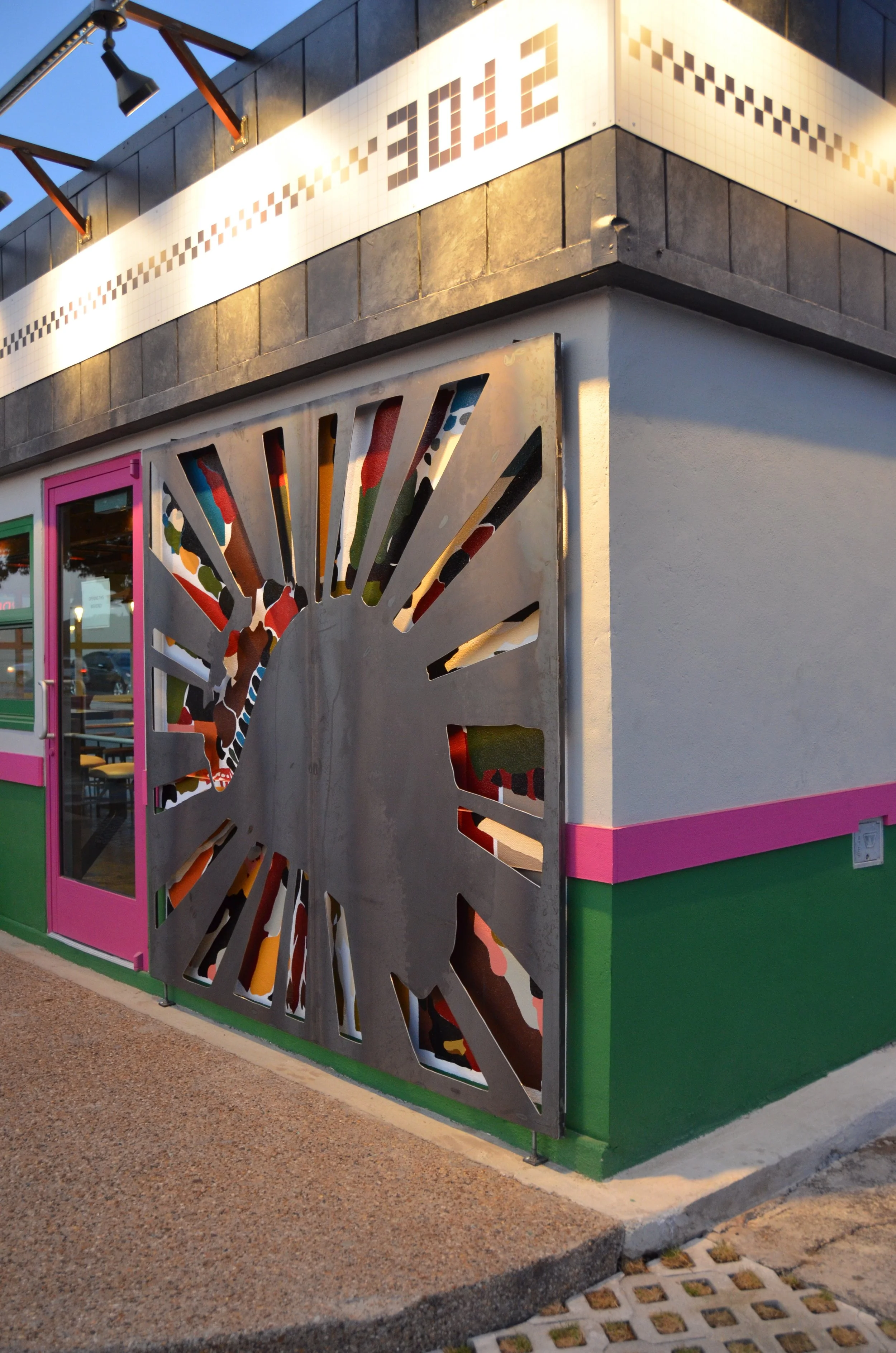
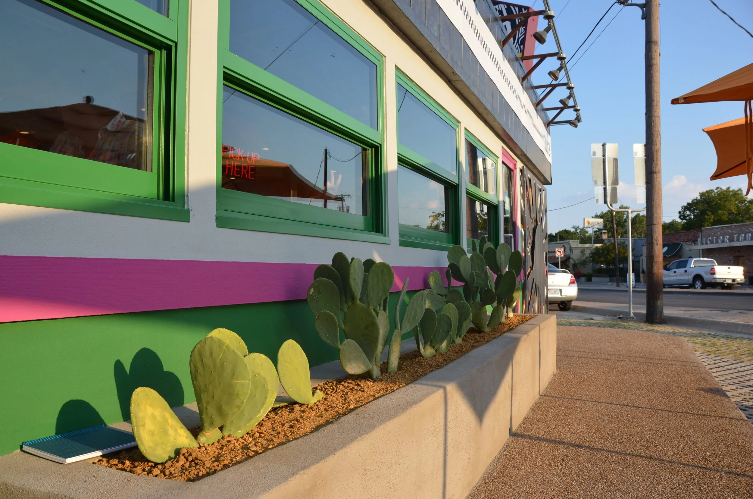
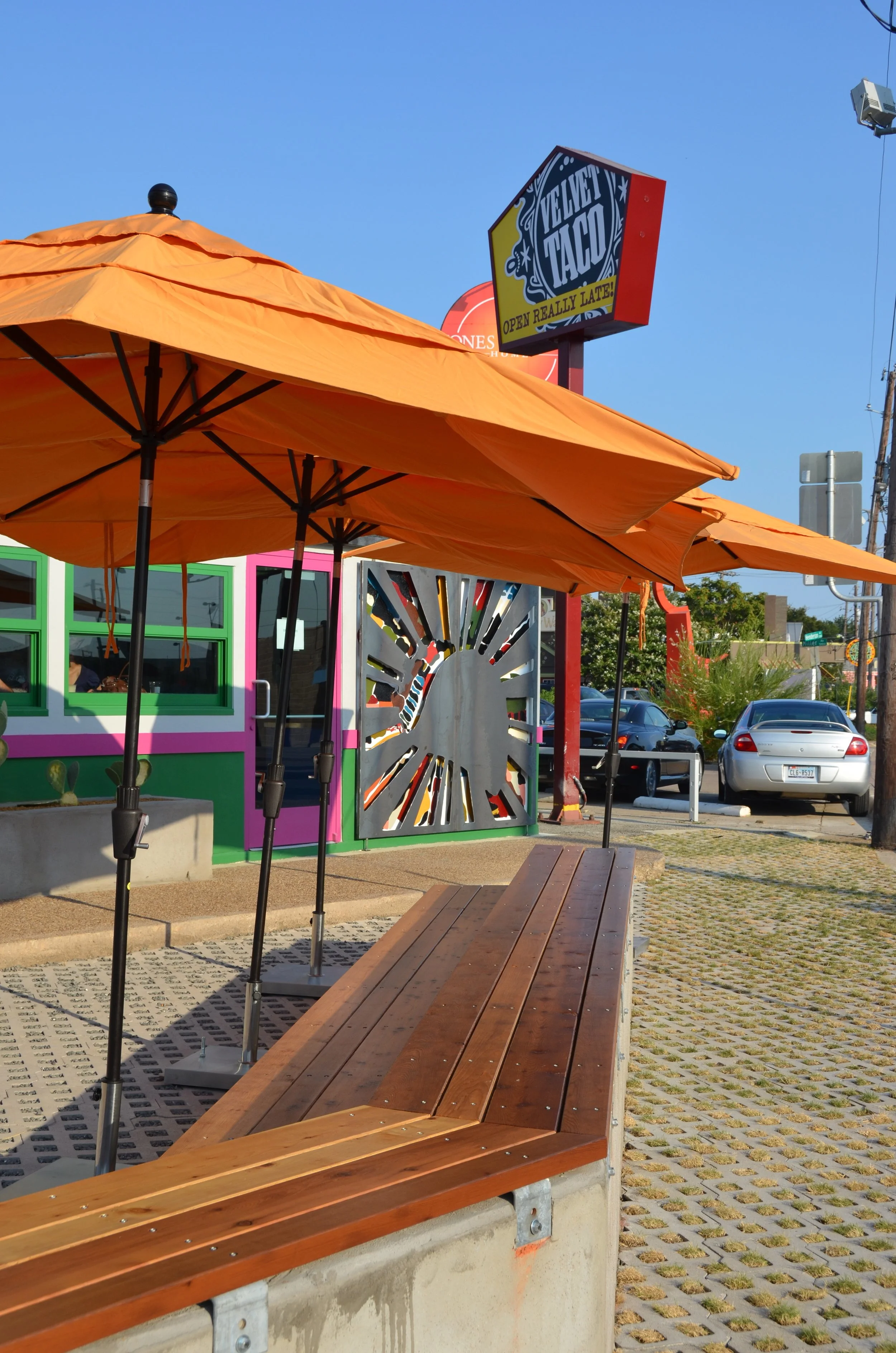
In a time when others were dialing things back, Velvet Taco leaned into boldness. The palette - hot pink, yellow, black, white, green, and burgundy - is unapologetically vibrant, carried through in exterior accents, interior finishes, custom art, and signage.
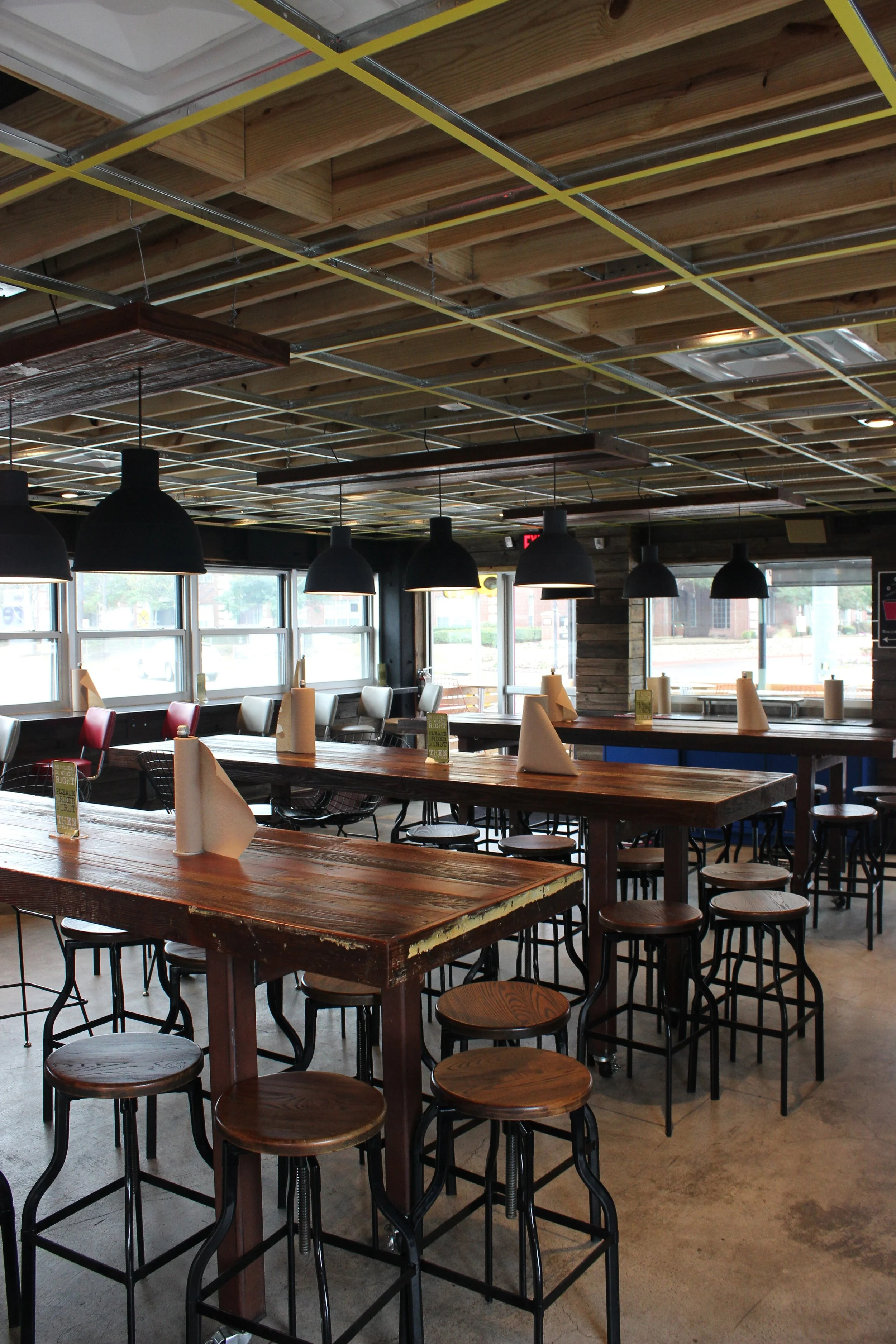
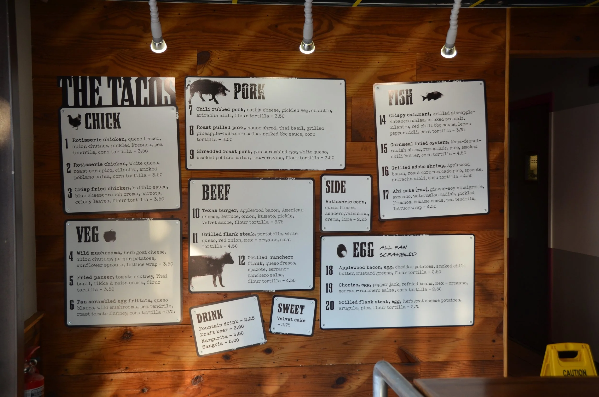
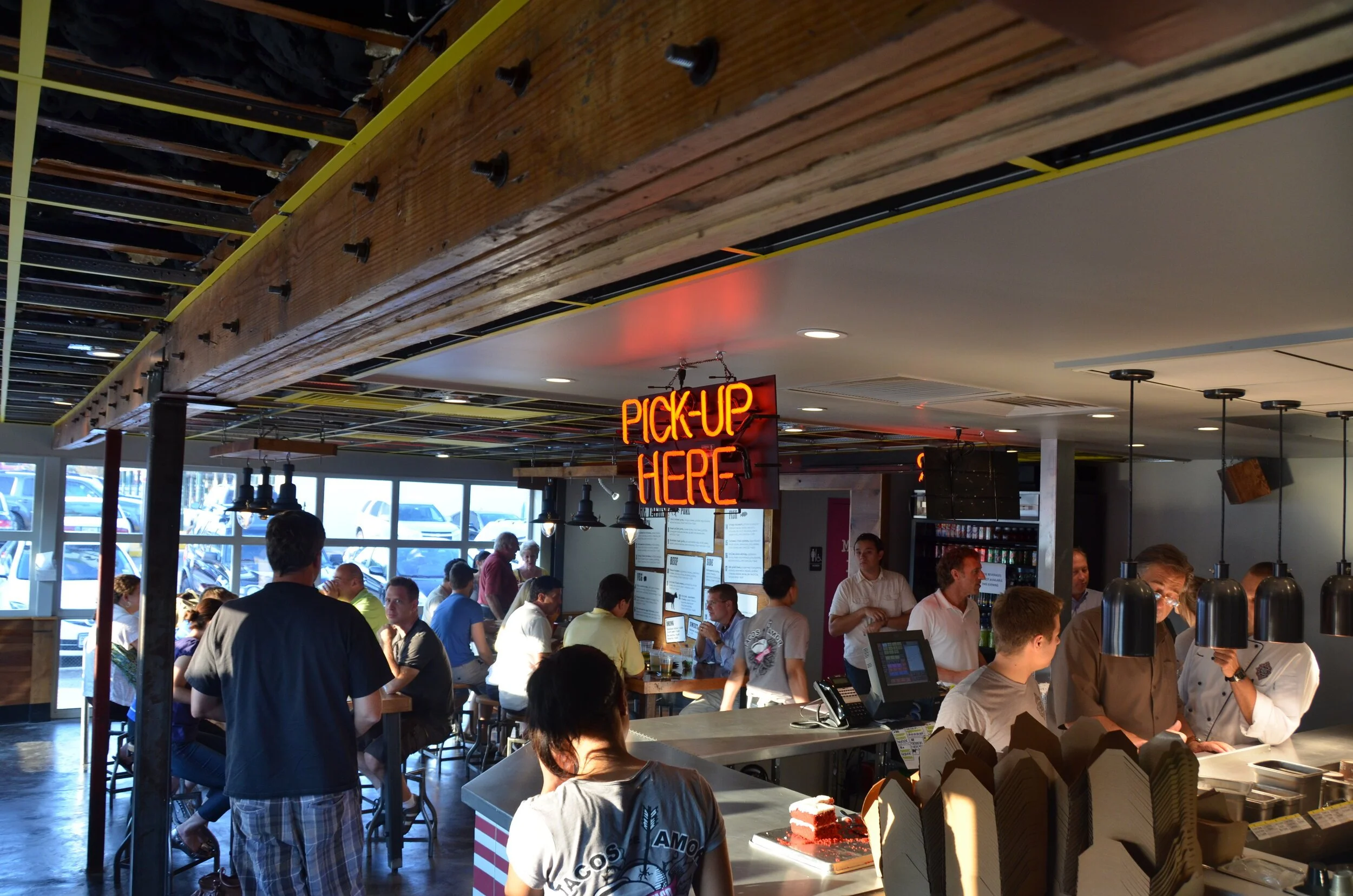
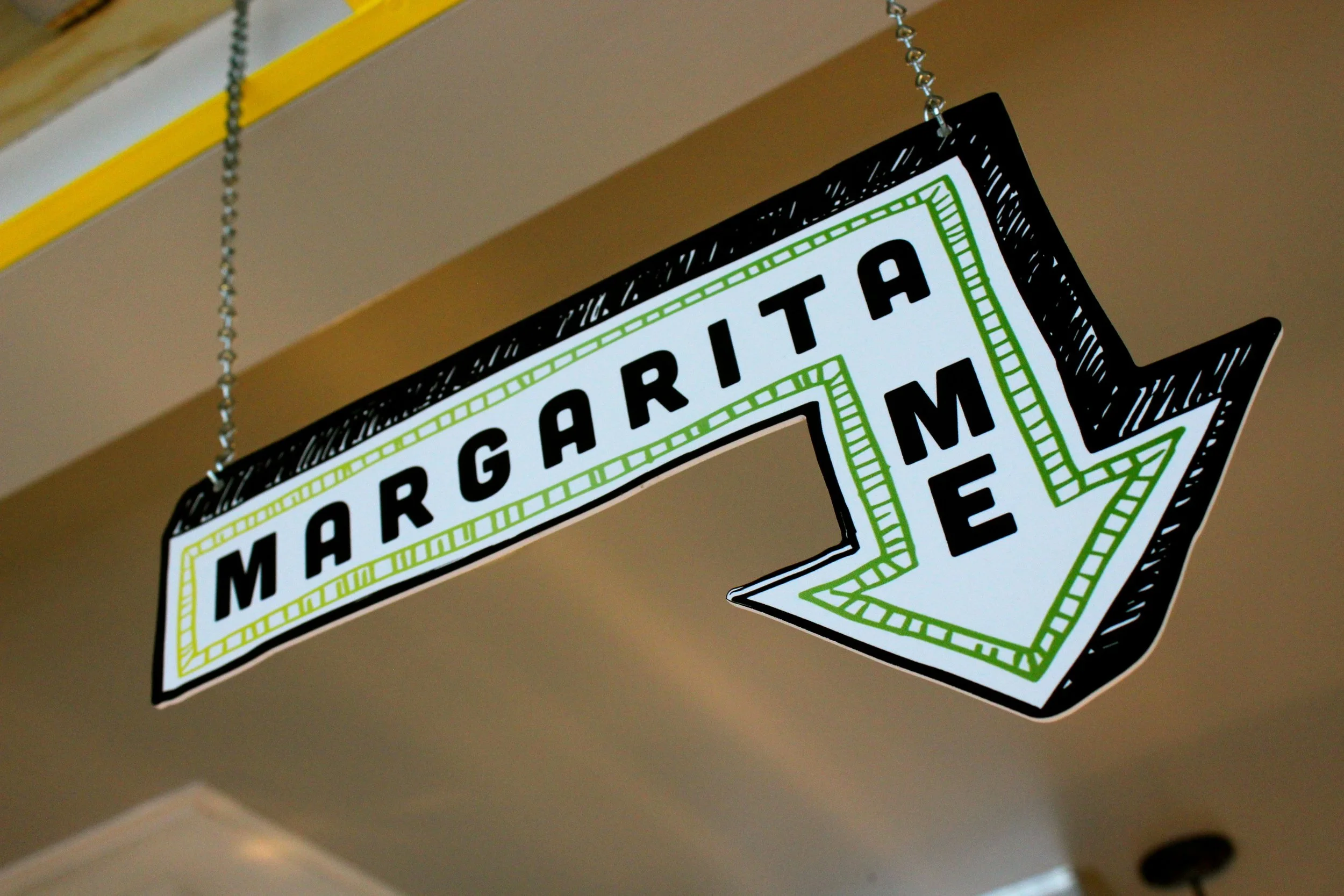
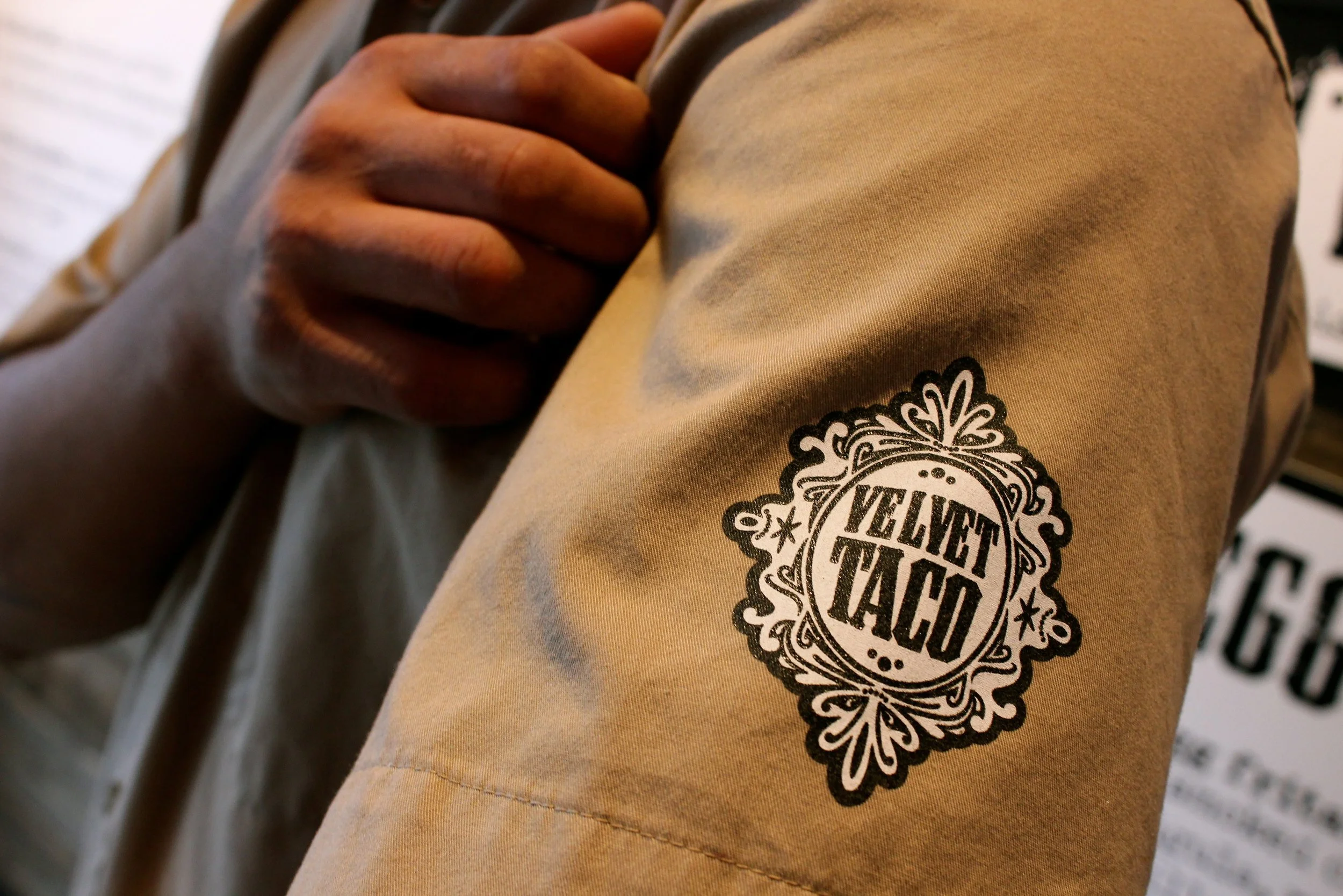
The architecture, interiors, and branding are packed with elements that are completely signature to the brand - from the decorative broche icon and checker-clad facade to the yellow-painted ceiling grid and highly graphic menu boards.
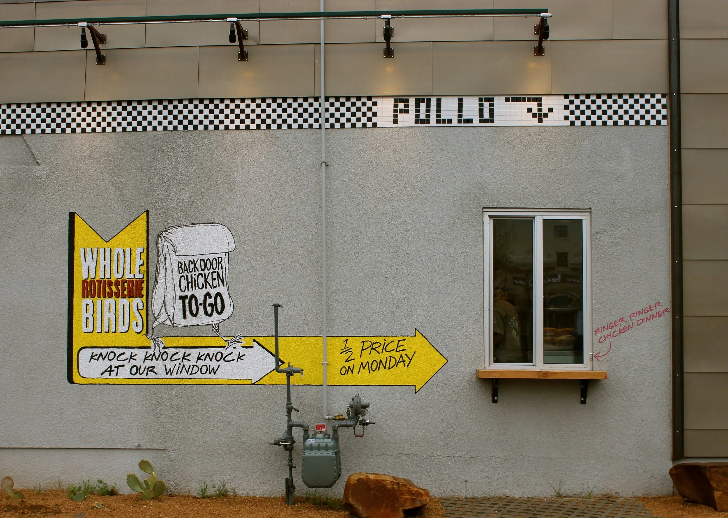
Design inspiration came from a mash-up of worlds: retro diner touches like leather bar stools and pink neon nod to Americana, while Latin influences in the brand colors and icon connect to the roots of tacos (or at least the tortilla). But we also introduced entirely new elements to fast casual dining - like the now-famous back-door chicken window, an energetic high-top communal dining layout, and an intentionally curated music experience that amplifies the atmosphere.
Velvet Taco is bold and it knows it. The witty, irreverent brand voice comes through in everything from the signage to the menu copy. “Let them eat cake… red velvet cake.”
Project Scope
Brand DNA
Name Generation
Logo Design
Architecture
Interior Design
Art & Signage
Menu Design
Packaging Design
Uniform Design